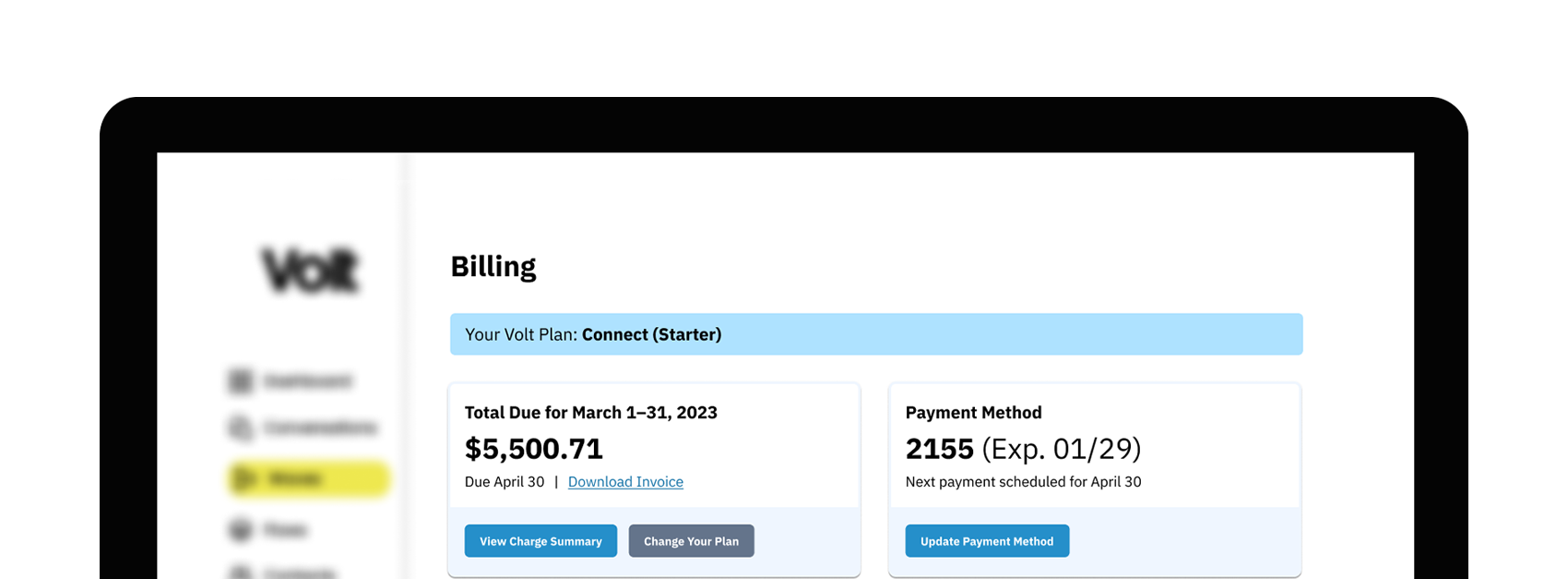
Billing Dashboard
Unified billing dashboard for text message campaigns with detailed insights at Volt
Clients struggled to manage the bills
Volt (textvolt.com) is a text messaging platform that allows companies to manage their texting providers in one place, automatically register phone numbers for compliance, and get insights into how often and how reliably their text messages are delivered. Clients loved our offerings, but after several product evolutions, parts of the experience began to strain as growth spiked.
We had recently finished streamlining onboarding to our core products when we discovered that our customer success team was under tons of pressure. They told us that our clients struggled to find and remember where Volt’s billing options were located and how they worked—or if they worked at all. They wanted to see past, present, and future bills in one place, rather than guessing at how to budget for their Volt subscriptions. We also wanted to make the charges transparent: who charged them, for what, and how much.

Our clients struggled to find and remember where Volt’s billing options were located and how they worked—or if they worked at all.
Scope and considerations
I had been waiting for an opportunity to build a centralized billing portal, and the recent growth spike gave me the chance to pitch the project. It echoed what the rest of the team had heard and received the green light.
Role:
I led the product direction, including design and research.
As the sole product team member, my output included discovery, competitive analysis, qualitative and quantitative research artifacts, information architecture diagrams, user flows, wireframes, prototypes, usability tests, new components, and related documentation.
I touched base with internal stakeholders 3 times a week, as well as updating all teams on my recent takeaways, open questions, and the expected product design direction.
Customer success provided client feedback as it arrived, as well as insight on what they needed. I worked closely with development to ensure we remained in scope for a relatively short timeline.
Constraints:
I had 1.5 months to deliver final designs.
Volt wanted to have the new billing experience completed in one fiscal quarter. I aimed to build out the product direction with 1.5 months, giving engineering ample time to build it out and work through any issues.
My vision for the MVP included the following major considerations:
The new page had to accurately reflect all charges across all entities, internal and external, reinforcing our message on transparency.
We needed to update back-end infrastructure that was creating delays displaying charges, ensuring clients received their data instantly.
It had to include a Stripe integration to replace our legacy system, so that Volt could manage all client payments in one place.
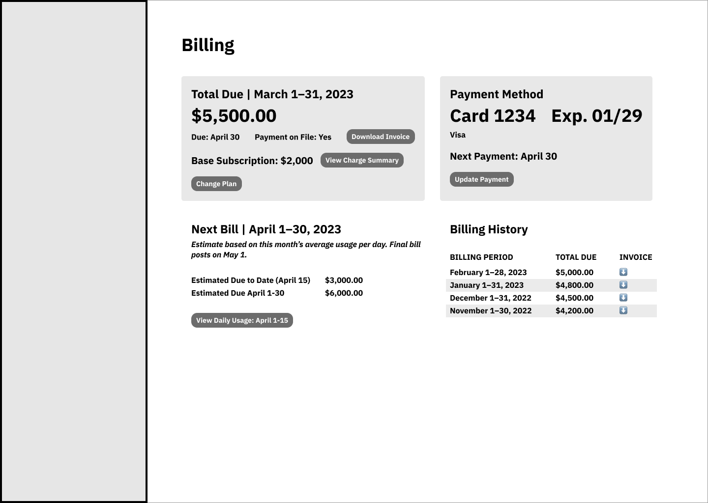
Low-fidelity wireframe of proposed billing dashboard
Working out the information architecture
Decision points
I had a vision for how I could display our clients’ bills, so I chose to explore what I’d done before, compared to what I saw in the market. We had a chance to take a new approach.
Decision 1:
Build a landing pad
Twilio’s Billing Overview
My competitive analysis revealed that there was room to grow in this space. While Volt didn’t have direct competitors at the time, I referenced the billing dashboard of telecom products that connected to ours (top image). It was clear that they hadn’t modernized their billing pages, either.
I turned to other SaaS products for inspiration and saw that they had employed responsive dashboards based on cards, similar to my approach with our Connect product. I passed some user stories by my customer success team and conceptualized a dashboard that prioritized the current bill and payment method over the next bill and history.
Decision 2:
Give the charge summary its own page
Our customer success team fielded requests, nearly every day, asking for charge summaries that showed who, what, and how much a client paid for their text message campaigns. It took 30+ minutes to process the data per request and was delivered as a dense, lengthy PDF.
I had deployed tables inside modals for similar breakdowns before, but charge summaries encompassed subscription, messaging usage, and phone carrier fees. It was overwhelming in its PDF format, too. I decided that something as intensive as the charge summary needed its own page and unique presentation, with the potential to filter and search it in the future.
Decision 3:
Reign in the MVP
Daily Usage modal wireframe
I had proposed a daily SMS/MMS usage modal, a Volt subscription overview, and filters for the charge summary initially. After speaking with current clients and discussing feasibility of each idea with engineering, I sorted these ideas into three categories:
Toss the subscription overview, since it didn’t add any value beyond what the client already knew.
Push back charge summary filters, since we needed engineering’s focus on the front-end experience and initial back-end implementation of the charge data points.
Keep the daily SMS/MMS usage modal, since it gave new insights on how their campaigns impacted their costs day-by-day.
Billing Dashboard
1: Typical data | 2: Daily SMS/MS Usage modal | 3: Change Plan (late implementation)
Charge Summary
Testing data

I made an hour-long process into a 5-minute interaction.
Our clients loved managing their plan and payment method in one place, which significantly reduced their time spent speaking to our customer success team.
Outcomes
I was thrilled to hear we made a difference in our teachers’ lives with these reports. I immediately highlighted what worked, as well as how we could make it work even better with tips and student groups.
Our clients loved it:
Skill checks became a touchpoint for Core5 teachers, who often worked with students needing extra attention.
They loved managing their plan and payment method in one place, which significantly reduced their time spent speaking to our customer success team.
They were surprised by the ability to track past and future usage, opening the door to better budgeting and usage management.
They appreciated the immediate access to subscription, messaging usage, and 10DLC (regulatory) charges, increasing our own transparency and revealing their best-performing phone carriers.
Next steps:
Our clients had a few notable requests.
Post-launch reviews indicated that we could add alerts for when new bills arrived or charges spiked unexpectedly, funneling our clients to our Connect product’s messaging analysis and giving clients the chance to react and reevaluate usage.
I recommended adding fully-autonomous plan changes and cancellations for subscriptions under $1,000/month, after adding a requested Change Plan page near the end of development.
Several clients asked about further details and features for the Charge Summary, inviting us to consider how we might implement new data and filtering in the next release.